
As always, I’m happy to be here with you today on Unexpected Elegance – I always look forward to my monthly visits!
Paint colors can be a stressful thing. It’s SO hard to know what the color will actually look like on your walls from that tiny little swatch you pick up at the hardware store…
When we moved into our home last fall, I decided to keep the walls in our main living areas neutral. Rather then test out new paint colors, I just used what we had in our previous home: Valspar’s Cincinnatian Hotel Briggs Beige and Valspar’s Woodlawn Colonial Gray.

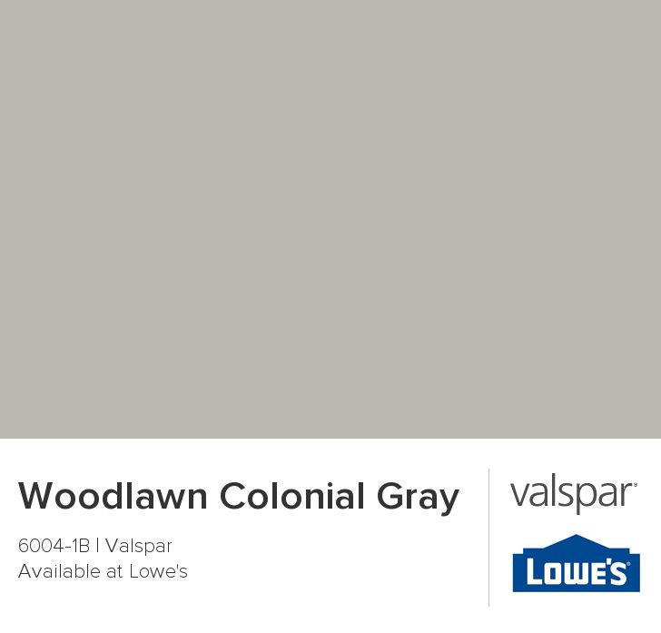
Here’s the deal. I love warm the warm undertones of the beige, but I also wanted some gray into my home. So, I use both a beige and a gray.
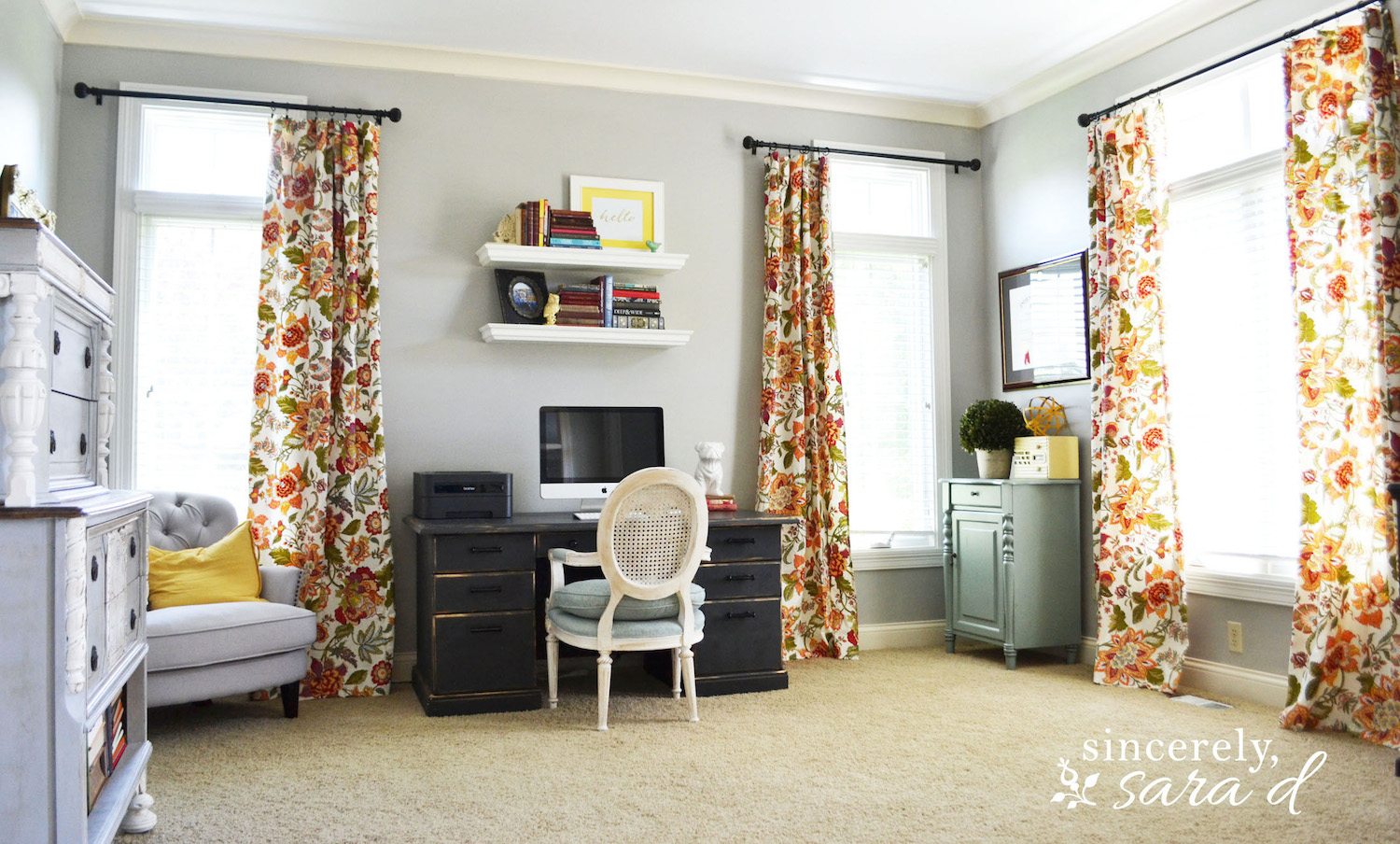
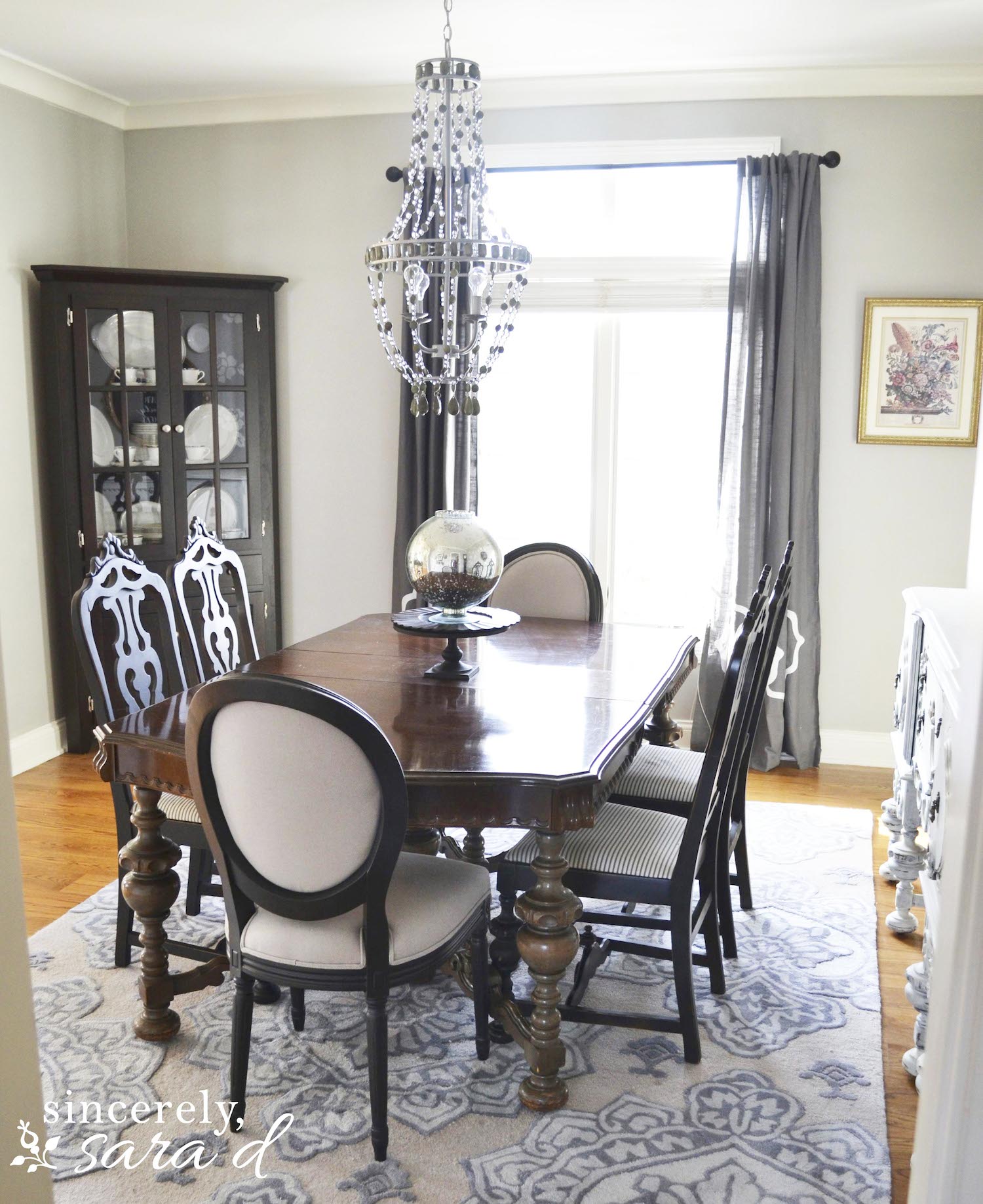
When you first walk into my home, you walk into the hallway and the office (painted in Woodlawn Colonial Gray) and the dining room (also painted in Woodlawn Colonial Gray) greet you on either side. I’m type A personality and if you follow me, you know I LOVE and NEED symmetry. So, I had to have equal color on either side for balance. However, I decorated the rooms with completely different color schemes although they both share the same common wall color. The office is fun and cheerful while the dining room is more sophisticated and subdued:

To see more about my office, you can click HERE.
Click HERE to see more on my dining room and HERE to see how I created faux wallpaper on one wall.
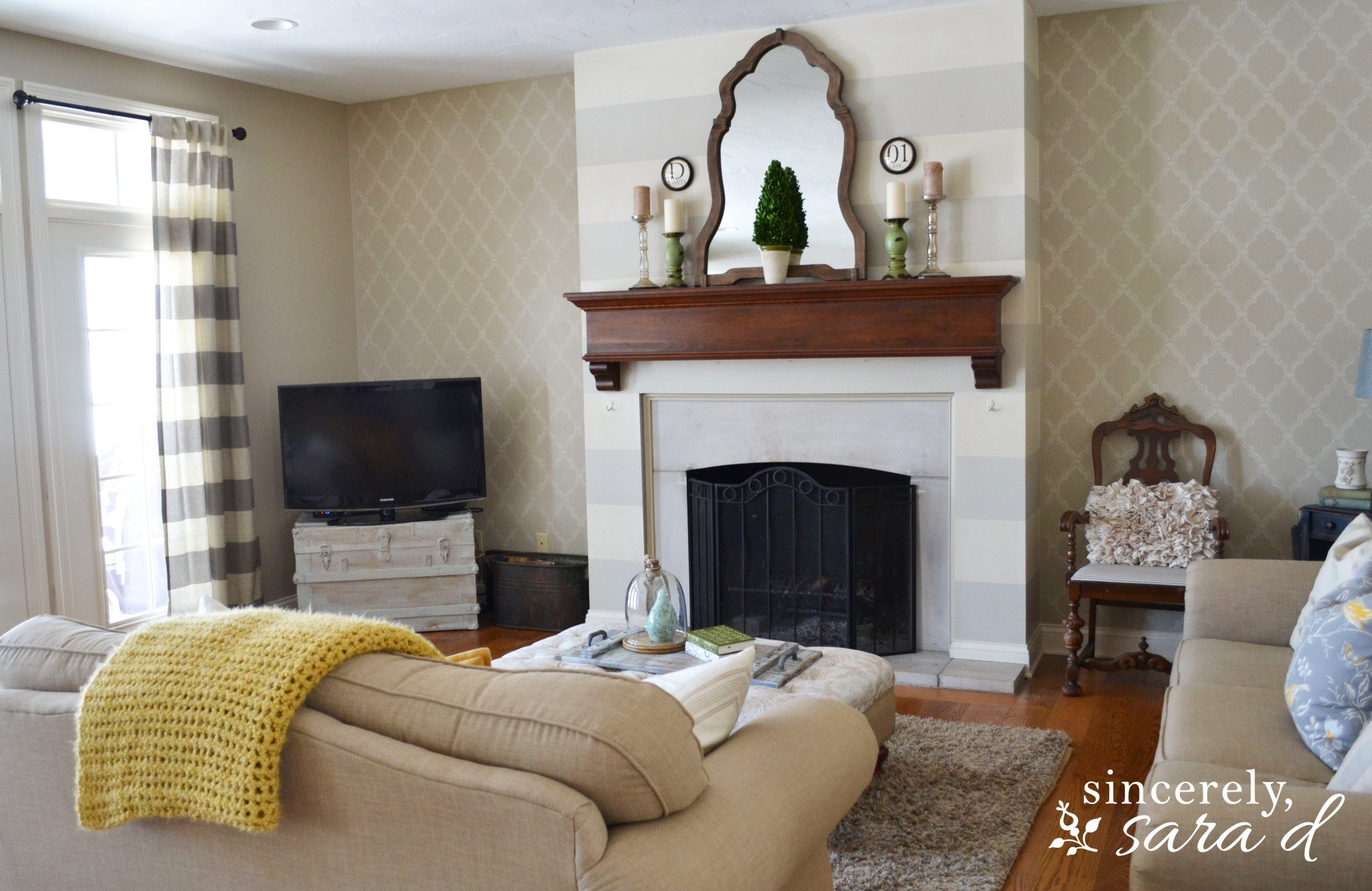
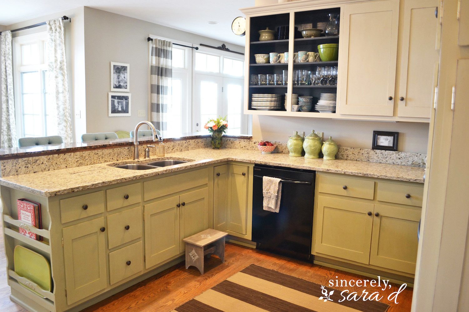
I used the beige colors in the back of my house – in the family room and kitchen. The two rooms connect, so I went ahead and used the same color throughout the space.

You can see more about my living room and the striped wall and stenciled wall HERE.
I painted my kitchen cabinets with chalk paint. Click HERE to see more.
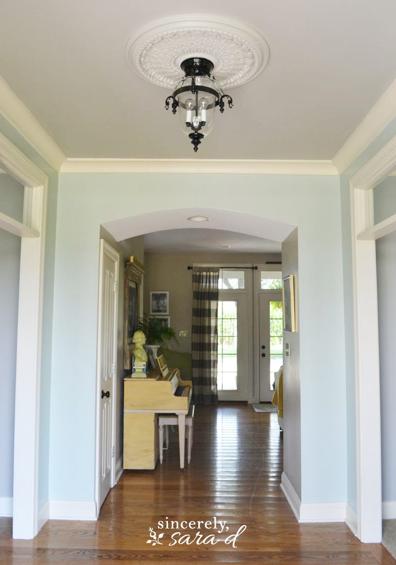
Valspar’s Niagara Blue is so pretty, and it does make some appearances throughout my home – like on my kitchen pantry door and in the hall entry.
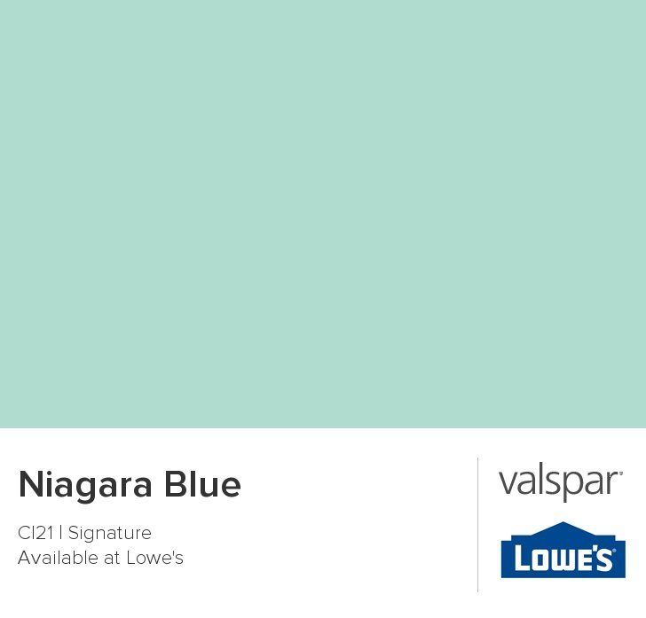

The Niagara Blue worked great on my pantry door, but it was a little too bright in my entry (there is much more light in the front of the house ). I mixed 1 part Niagara Blue with 1 part Cincinnatian Hotel Briggs Beige, and the result was the exact blue I wanted!
Painting really is the least expensive way to instantly change your home. Go have some fun with paint! If you hate it, you can always repaint! 🙂


Hi! I love the scheme of colors. I noticed the color of the trim and how it looks like a creamy white. Would you happen to know the color of the trim?
Tiffany, this is Sara’s house but I’m sure she’d be happy to give it to you (if she knows). You can email her at sara.davis@ymail.com.
Beautiful color choices and a beautiful home! Would you share where you purchased your dining room rug?? It’s perfect!
Hi Loren – thank you! I found the rug at rugsusa.com, but unfortunately I can’t find the link for it.
Great article! Thank for sharing. It is what I am looking for.
Your tips help me spend less time choosing every day! Thanks I will apply it to What Beats Rock !
Interesting choices using both beige and gray! The symmetry is a nice touch. Reminds me of navigating the color palette in a game like Slope – finding balance and avoiding pitfalls. Perhaps adding some accent walls in a bolder color could further define the spaces and add even more visual interest.
When most people think of Goa, they picture sunny beaches, lively shacks, and endless parties. But have you ever experienced Goa in monsoon The rains transform this coastal paradise into a lush, breathtakingly beautiful retreat, making it the perfect time for a peaceful and rejuvenating getaway. If you’re looking for a boutique stay that offers comfort, wellness, and serenity, look no further than Soul Vacation—a tranquil resort near Colva Beach, designed for those who want to unwind and reconnect with nature.