We are to the finish line of the Timber Pointe Outdoor Center cabin transformations. This last one is the biggest by far and there is so much to share that I decided to break it up into two different posts.
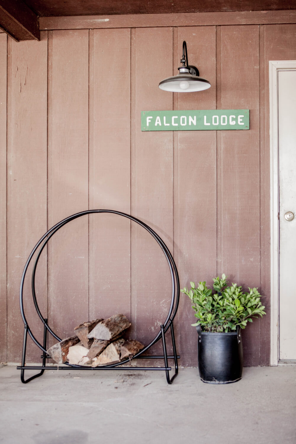
The spaces I’m sharing this week are the entry, kitchen, and large bunk room. I’ll take you through the before and after of each room/area separately so you can get a feel for what I did.
For the previous cabins, check out these posts:
Order of the Arrow | Crow | American Eagle
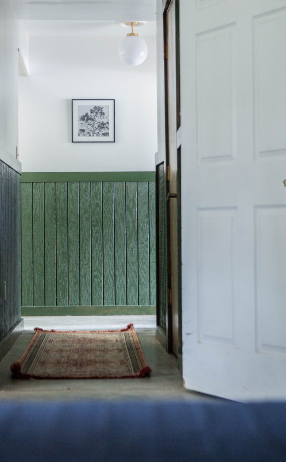
Here’s the BEFORE of the lodge entry…
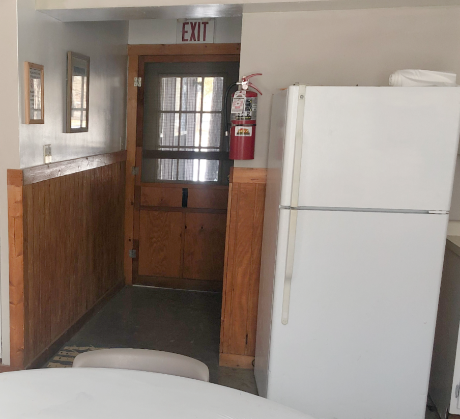
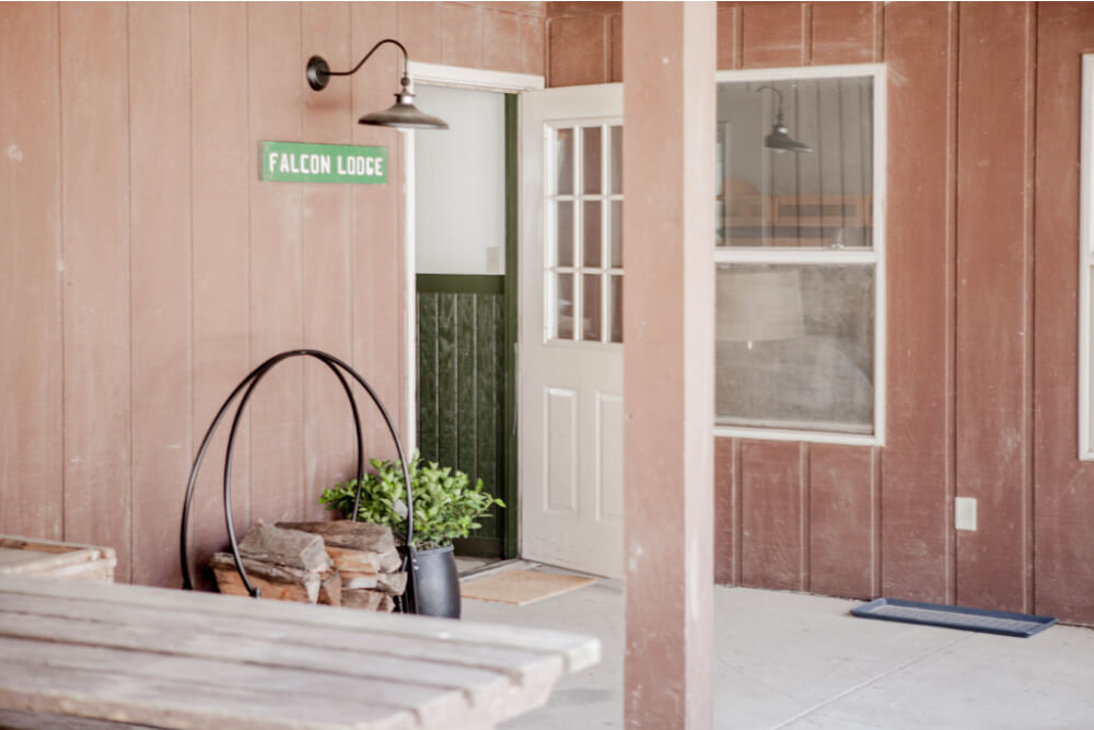
A new light fixture and a few updates, lead you into the new entry…
I added a bench for two reasons: to cover up a large pipe sticking up from the ground and a place to put your shoes on.
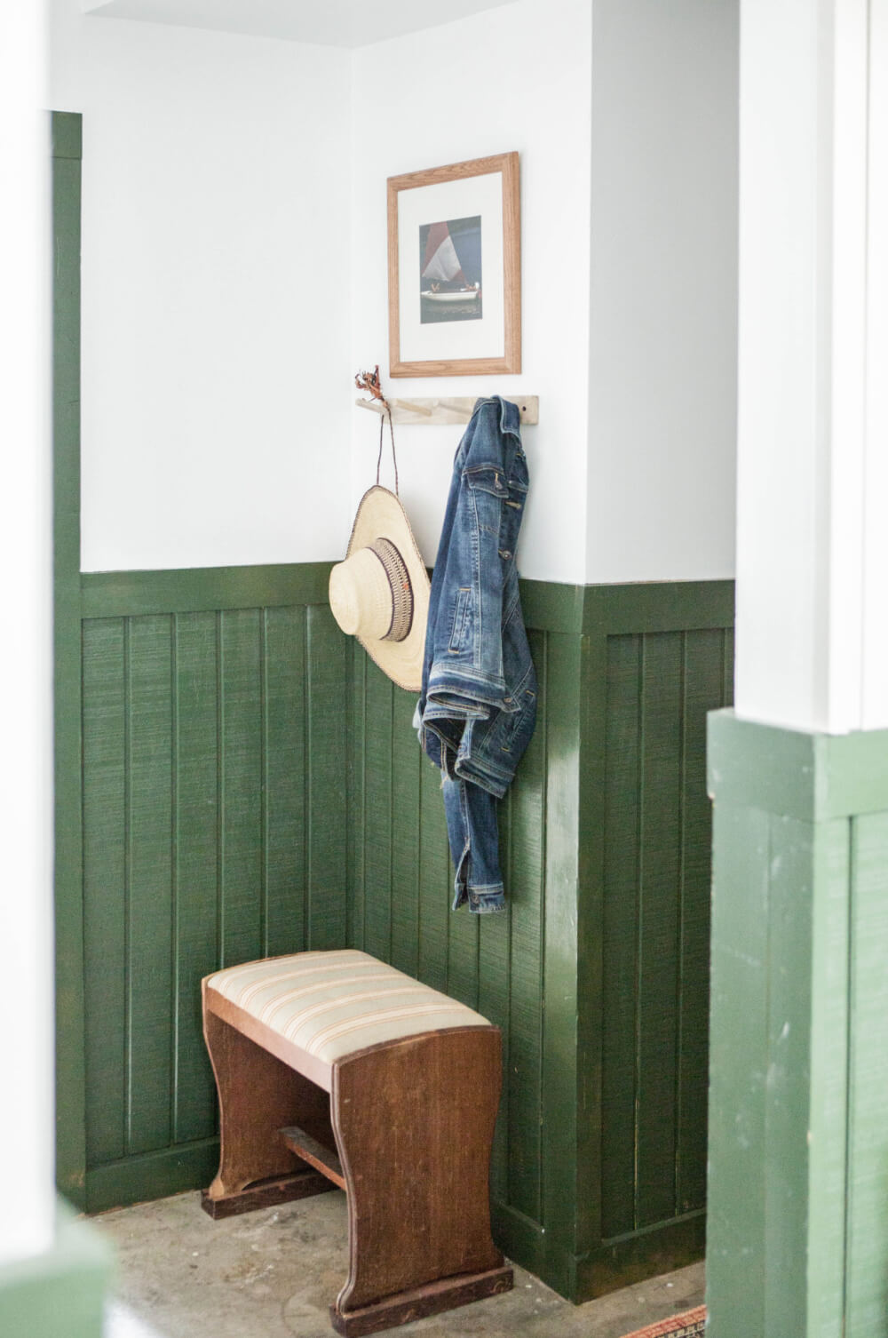
There’s no “coat closet” so hooks are a must! To the left of the entry is large bunk room.
Here is what it looked like before I started the makeover…
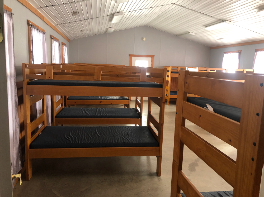
This room was storing some extra beds so we removed the ones that didn’t belong and rearranged them a bit.
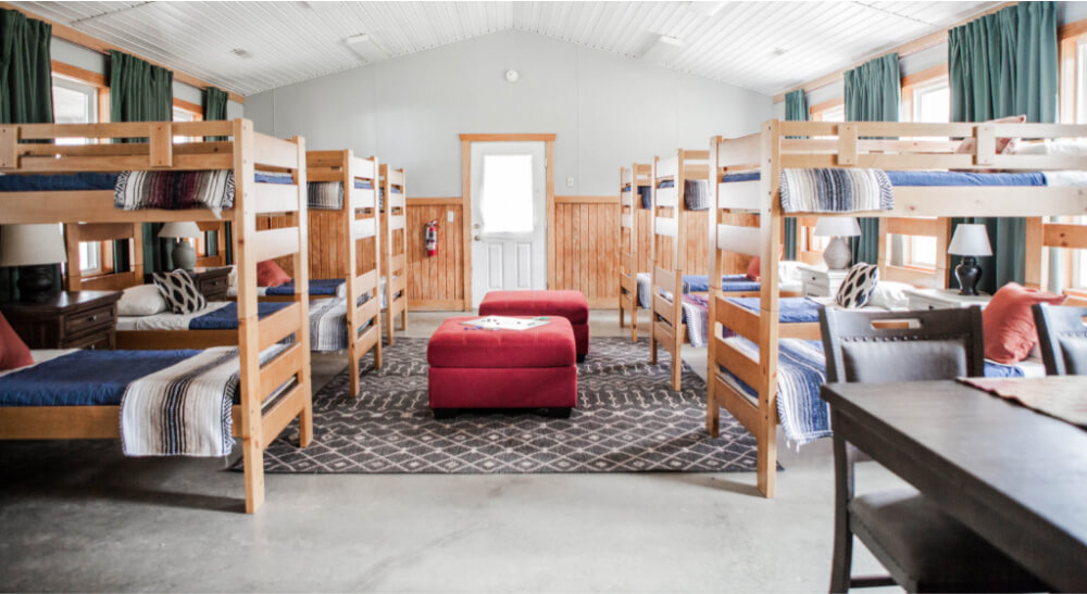
The biggest impact came from the curtains and rug. They immediately softened up the large room and made it feel cozier.
This room alone has 8 windows, so I found some inexpensive curtains from Ikea and used copper pipe to span the entire length of the wall (I think one side is 28 feet).
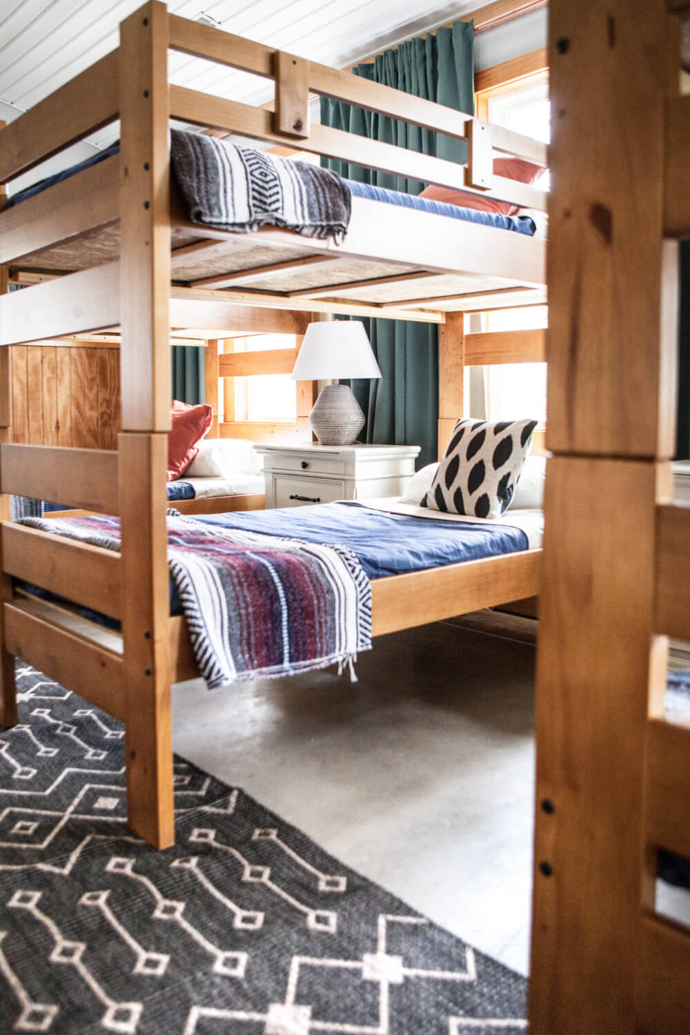
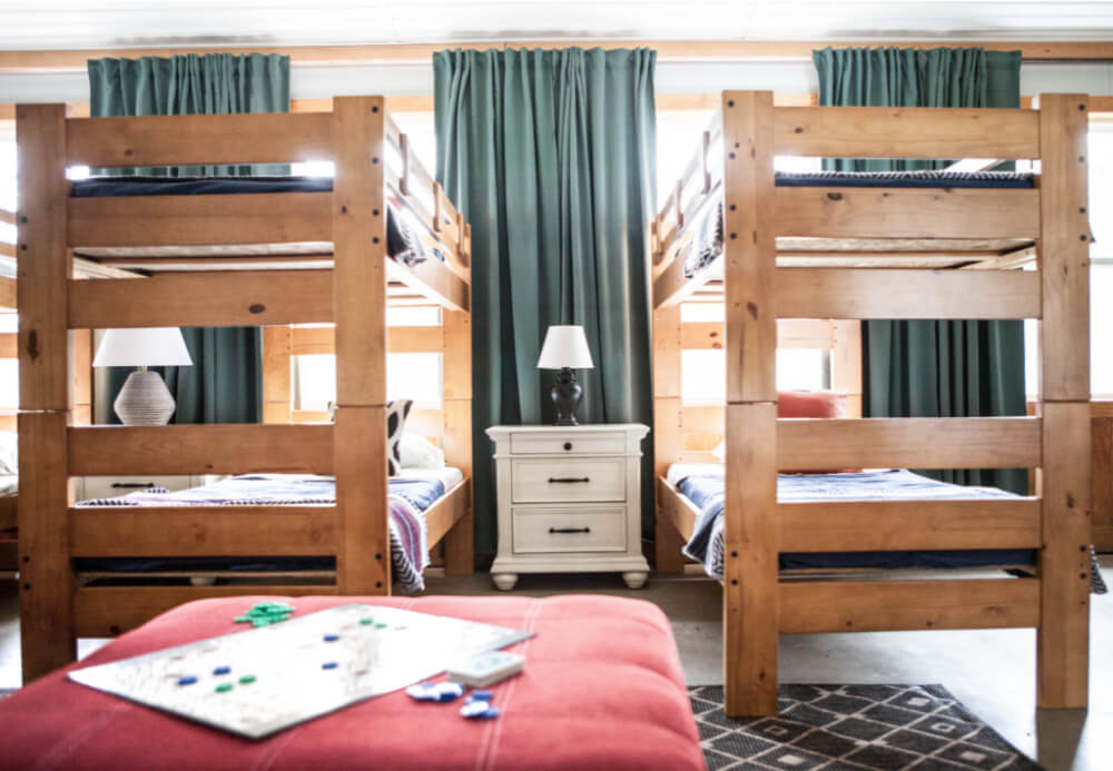
The Room Place donated some amazing pieces for this room. The nightstands have built-in USB ports, which make charging very convenient.
I found a hodge podge of lamps from thrift stores to go between each bunk bed. Now the guests will have some ambient lighting in the evening, instead of the harsh overhead incandescence bulbs.
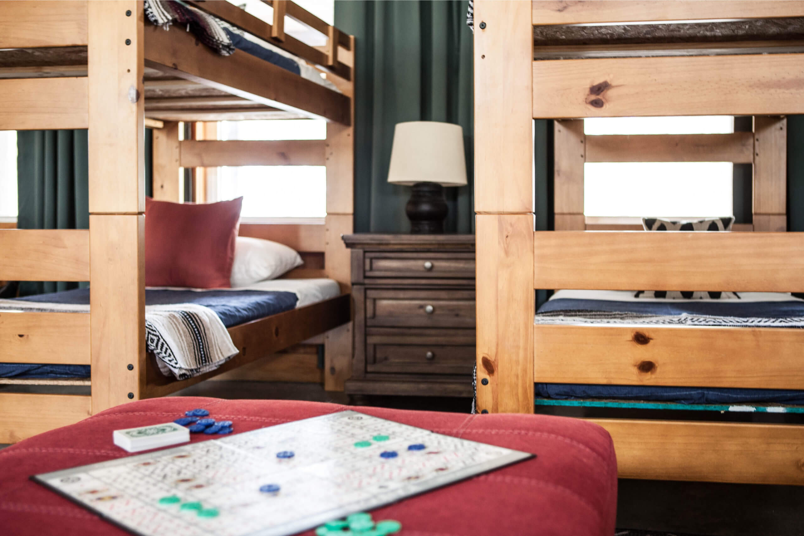
Also, the large ottomans are a great place for the kids to hang out or a place to sit while your getting ready for the day.
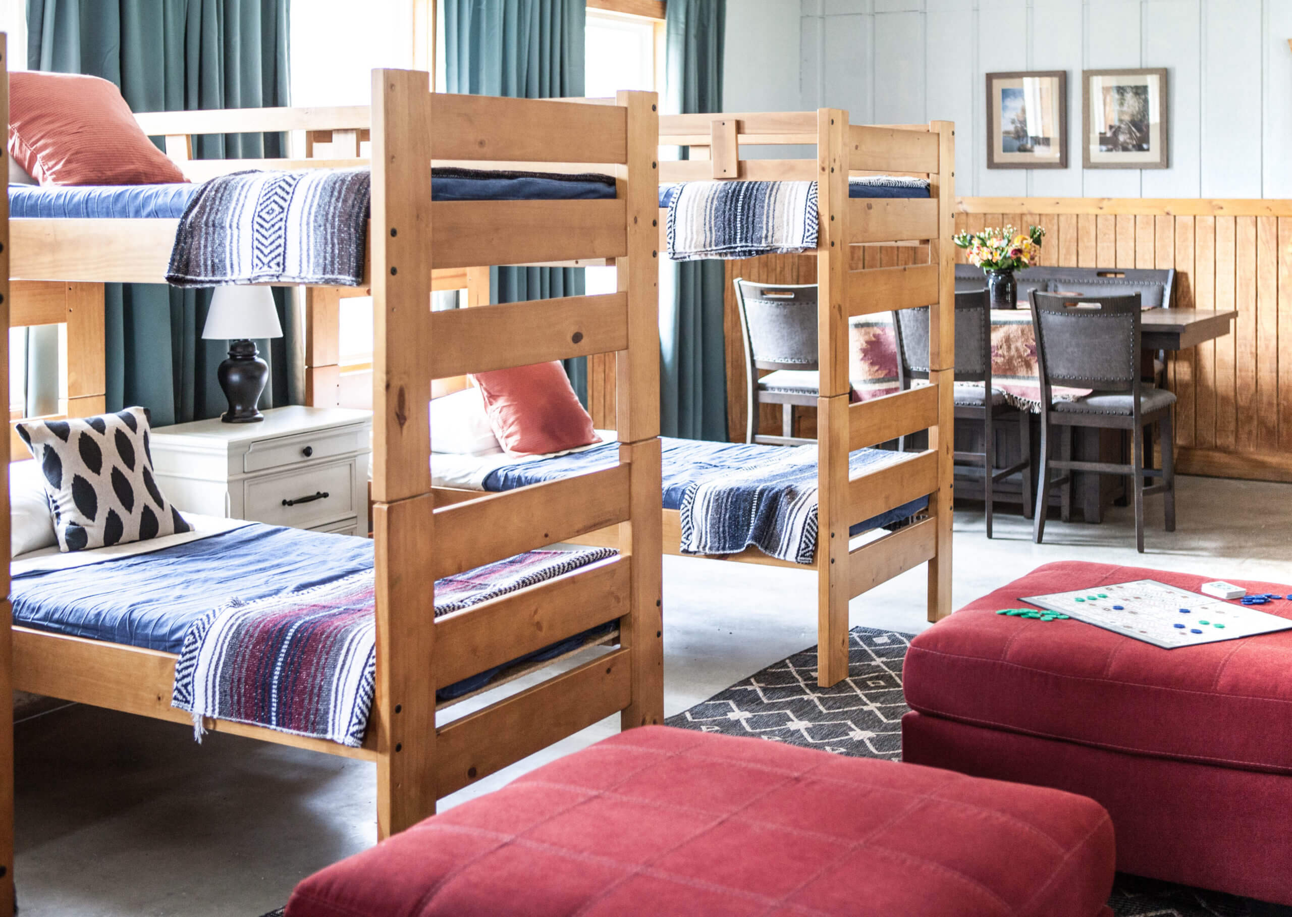
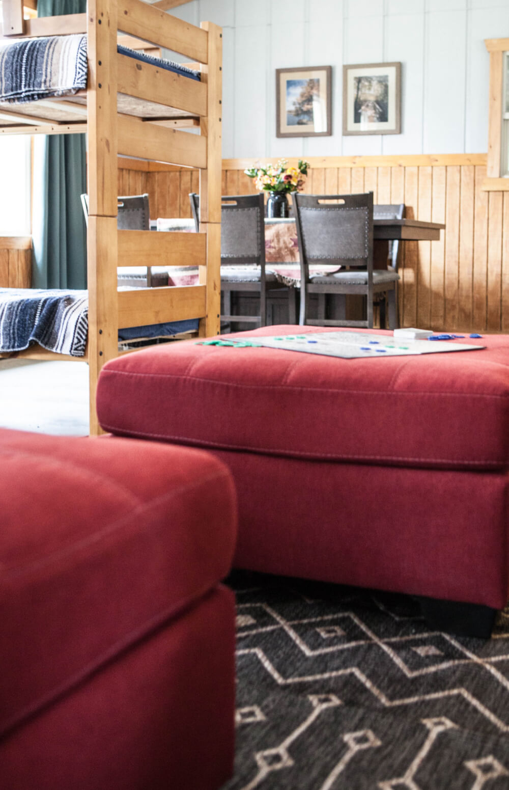
Since this cabin is so large and can host so many guests, we have two dining tables. This one from The Room Place is great for games, as well as eating.
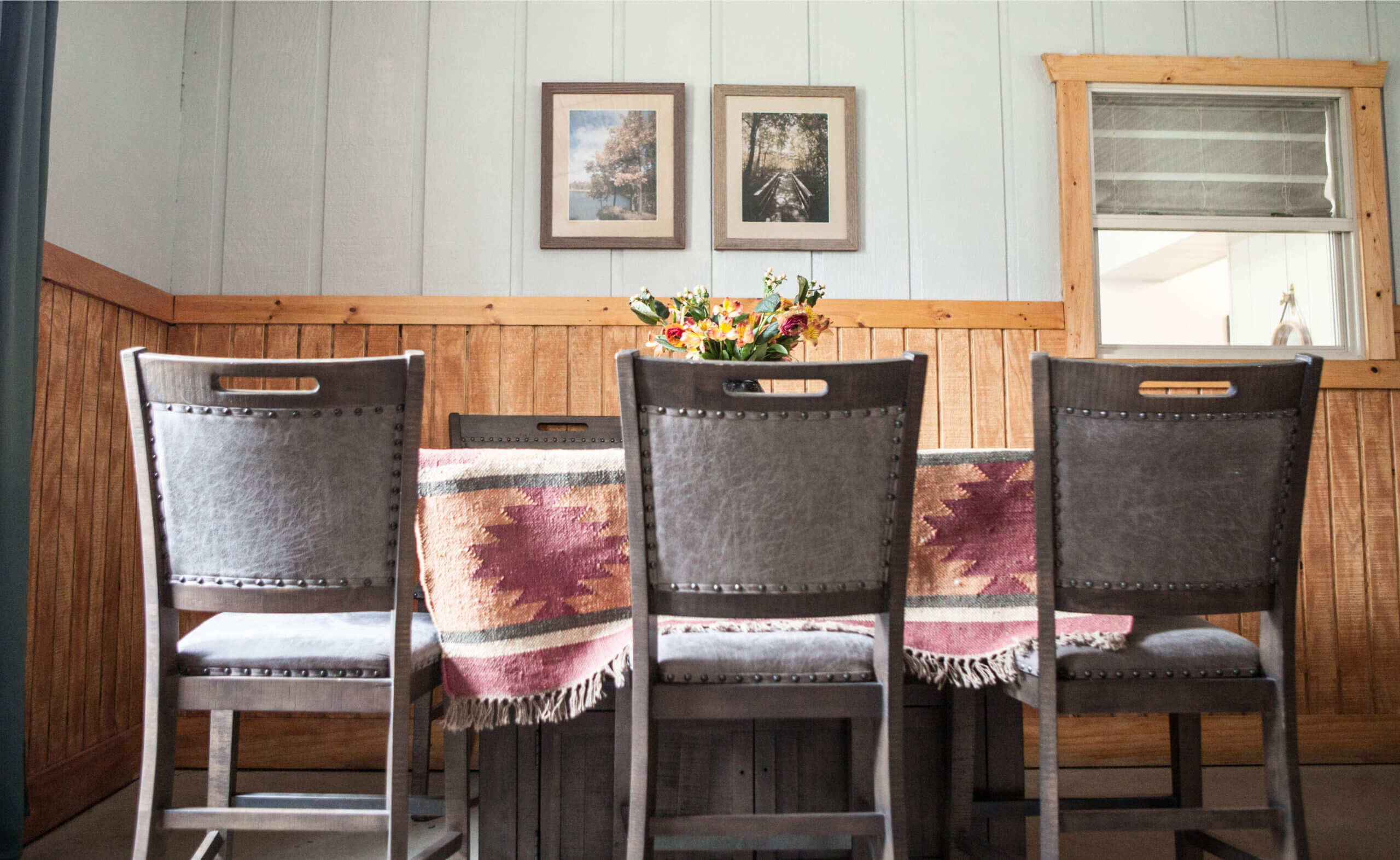
My guess is that this room was an add on. You can see in the above photo there is a window to the kitchen…which is our next stop.
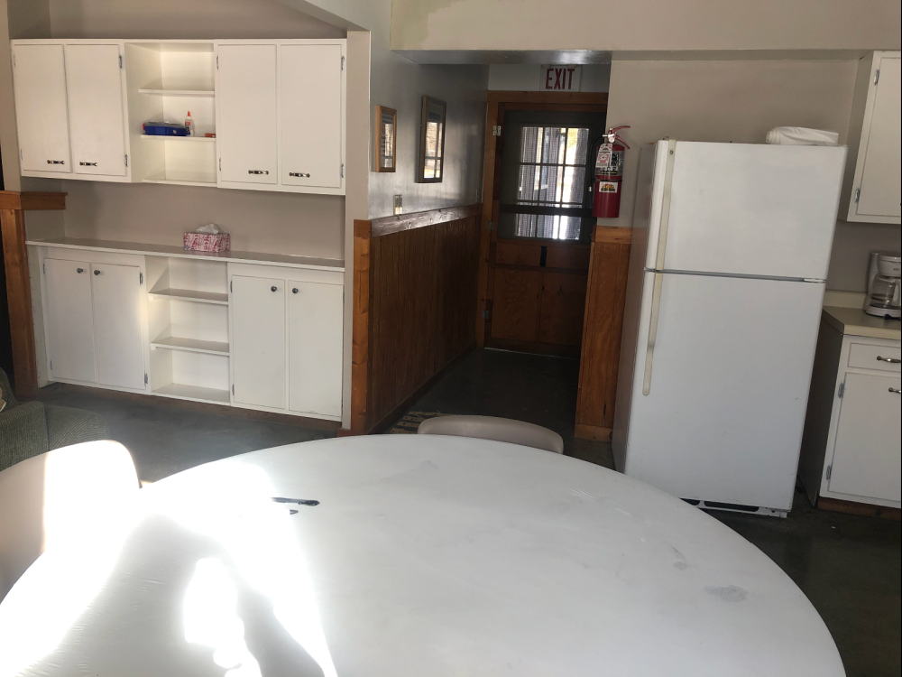
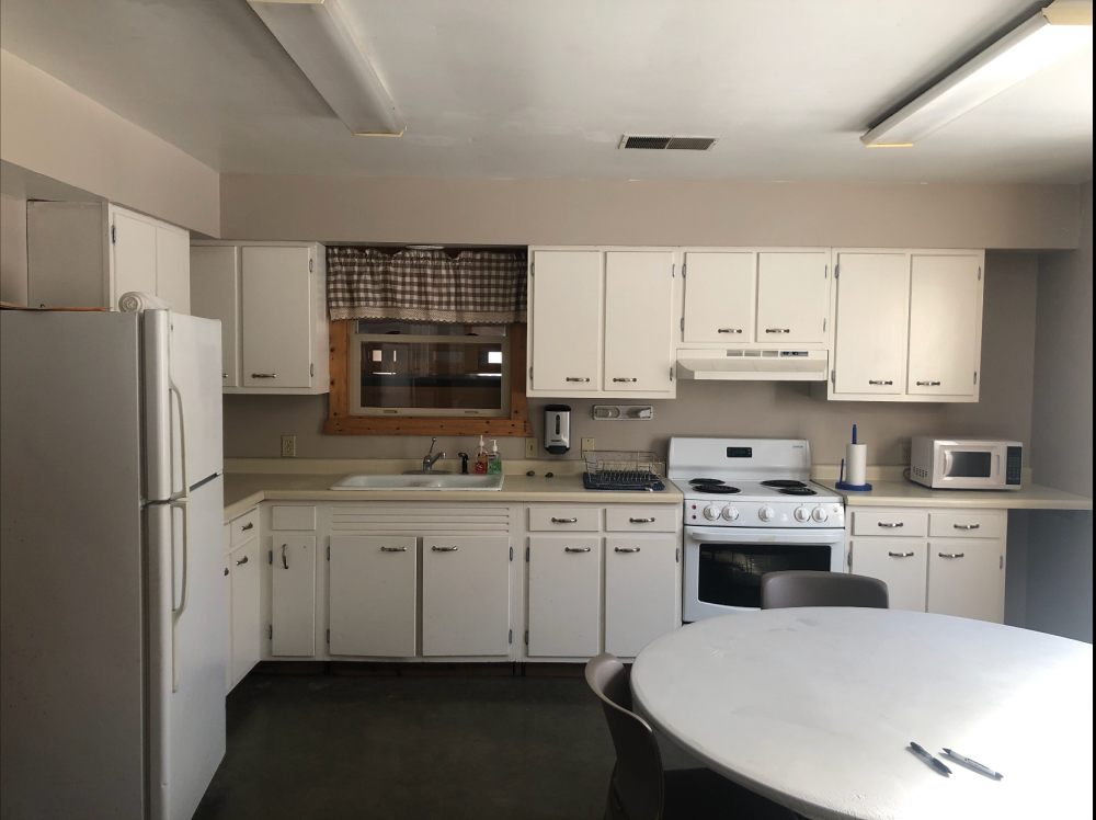
Here’s the kitchen BEFORE…
You enter it straight from the front door.
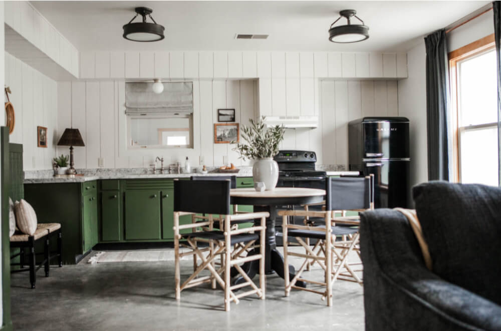
AND here is the AFTER…
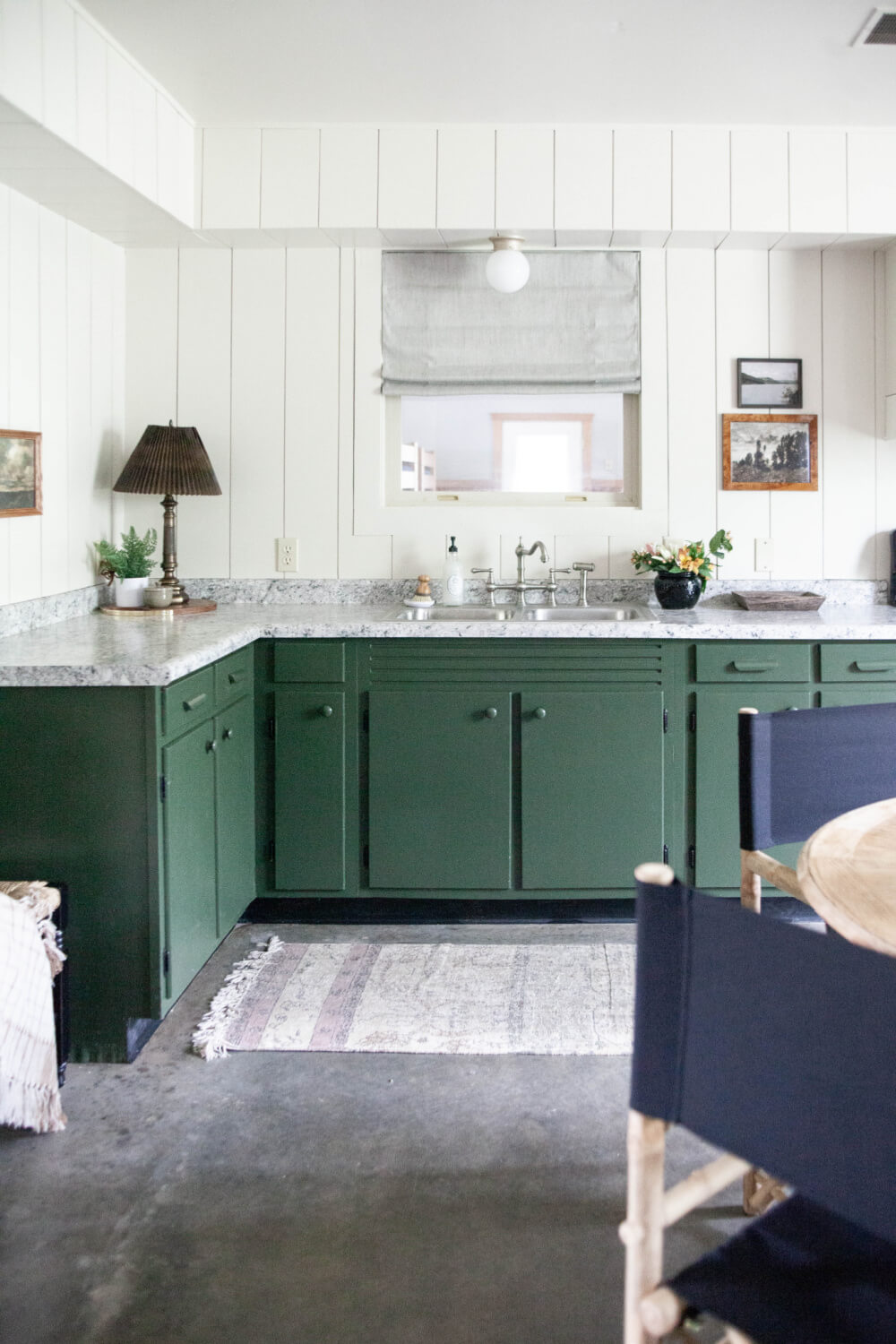
I spent almost all my time working on this “room”. We kept the lower cabinets, but that was pretty much it.
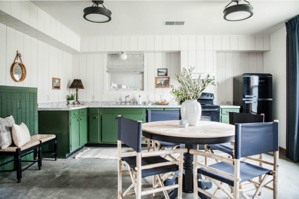
I removed the uppers and reconfigured the layout slightly.
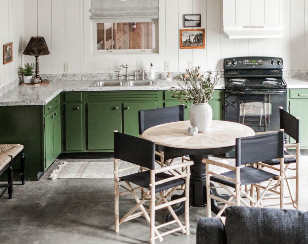
The new refrigerator moved to the same wall as the range. This freed up some space by the entry.
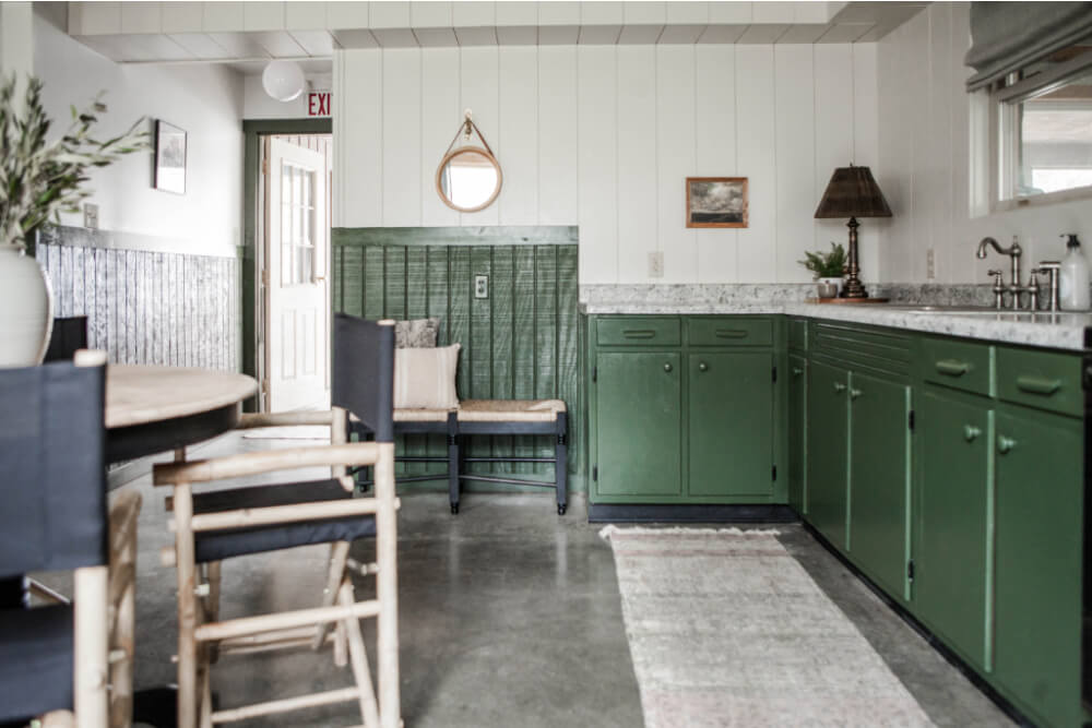
It originally felt so crowed when you first walked in and this makes it seem larger.
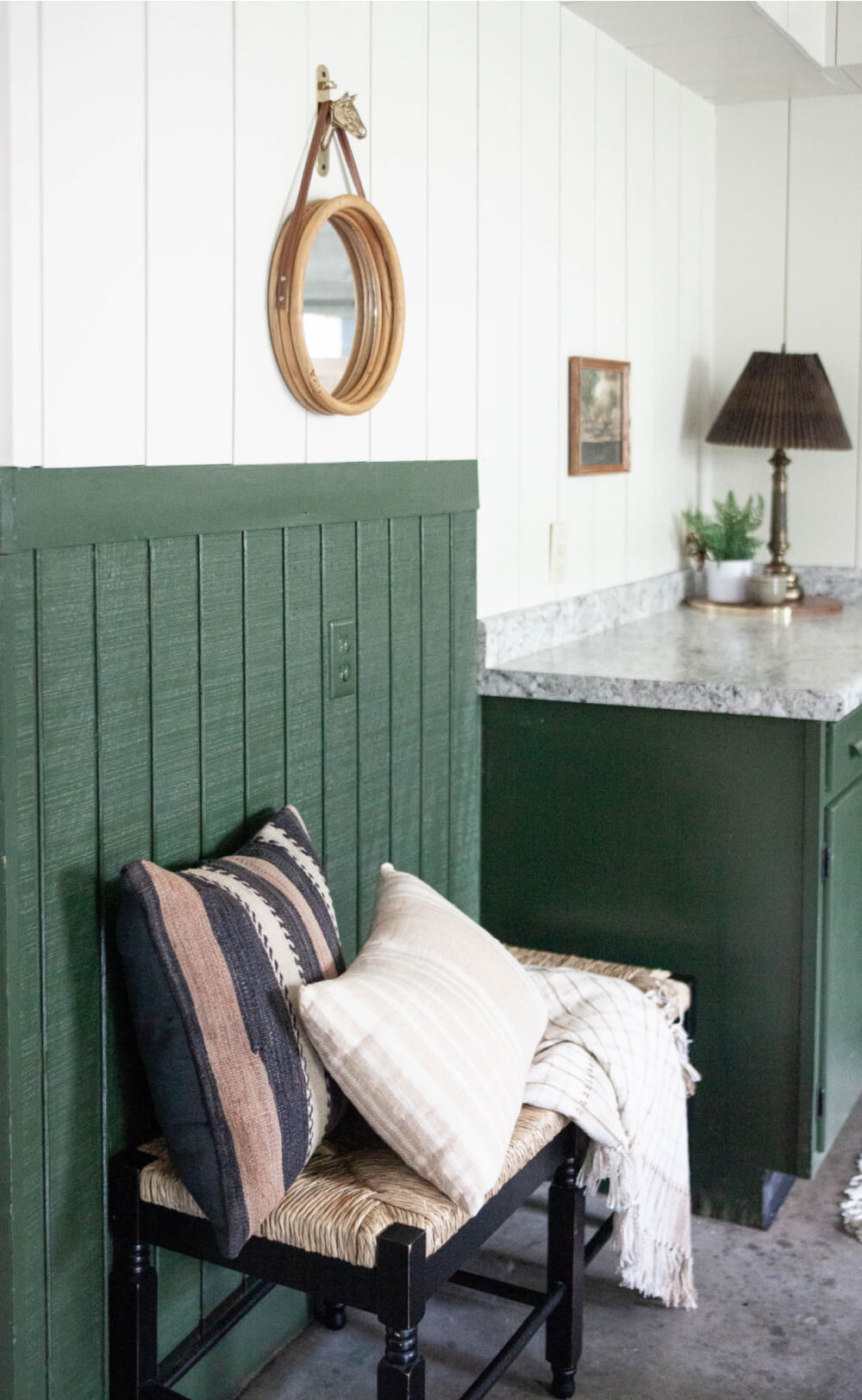
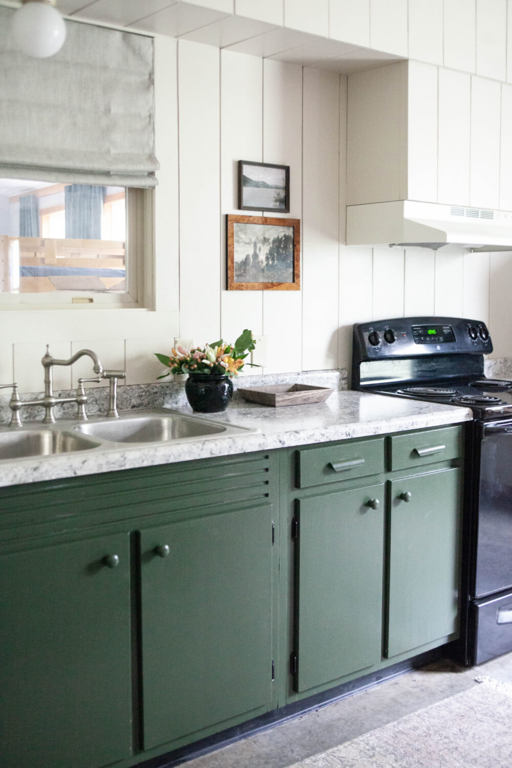
To give the walls some interest and, somewhat, hide the bulkhead, I installed large-plank shiplap.
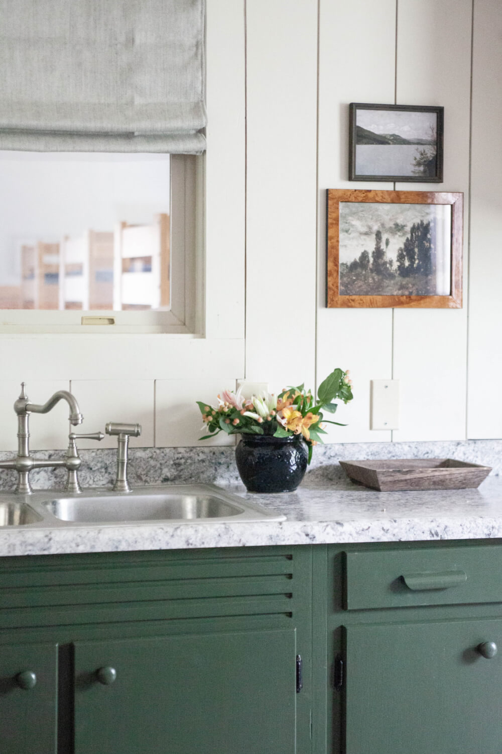
An inexpensive hardware store countertop made a HUGE difference, as well. BUT my favorite is the faucet!
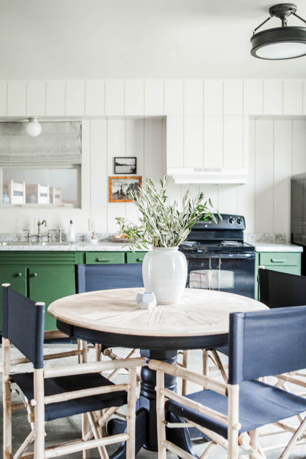
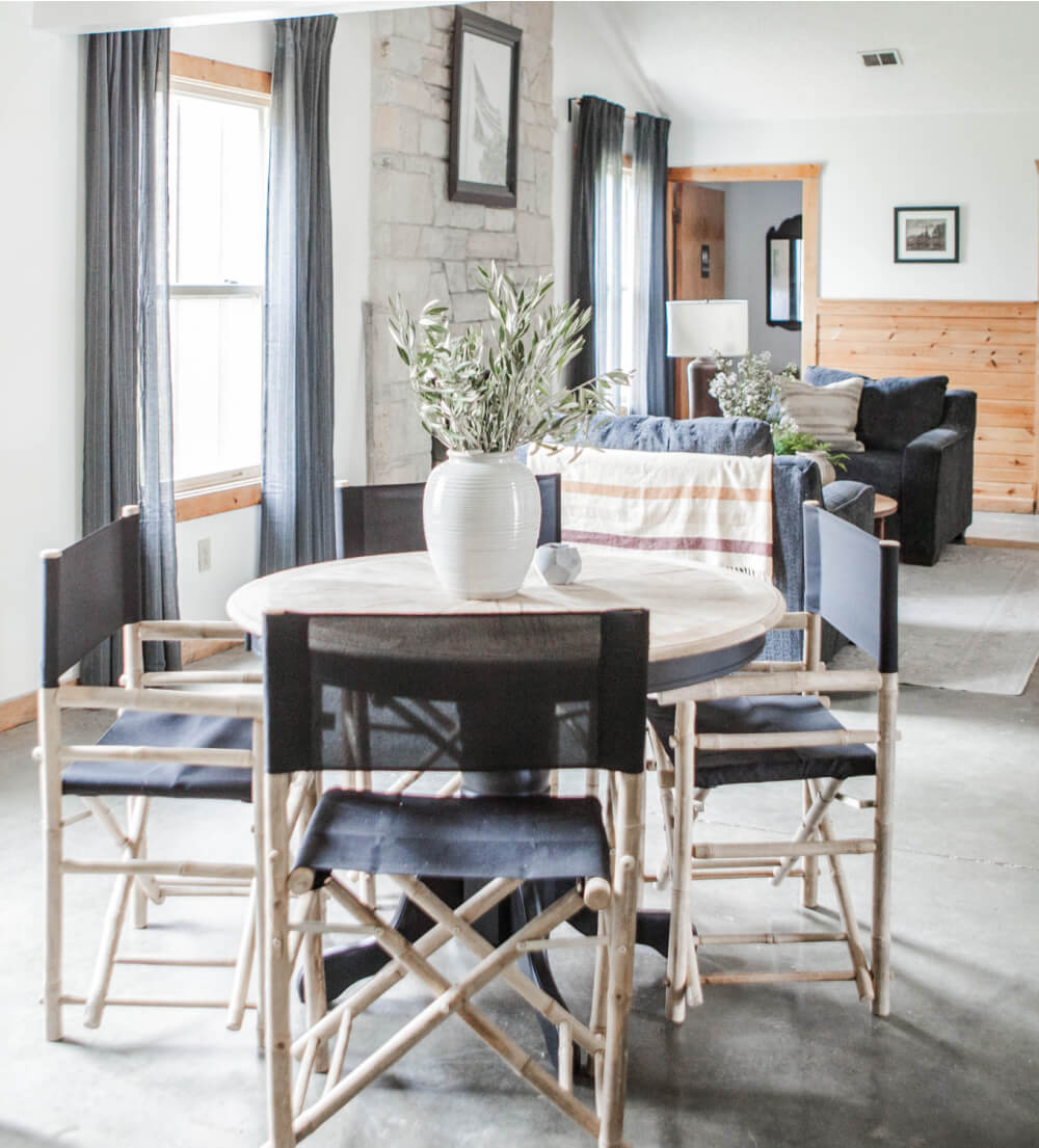
The kitchen table was another thrift store find. I stripped the top and painted the base. I bought the director’s chairs because they helped ground the space and are easy to store and move.
Check back in a couple of days for the rest of spaces! Here’s a sneak peek for you…
Again, THANK YOU to The Room Place for their wonderful furniture donations!!!

Such a great transformation. This is magic!
I thoroughly enjoy reading your blog from time to time because you have plenty of great home decor ideas that don’t require significant expenses, which I really appreciate. Sometimes, I have extra money since I play in foreign online casinos in Estonia from the review https://valismaa-kasiino.com/ which provides complete information about them. I always spend part of my winnings on improving my home’s interior, using your advice. By the way, the platforms from this review often offer various bonuses to players, so fellow gambling enthusiasts like me will definitely find them appealing.
I explored many online casinos, and finally found argoldensands which offers a lot of exciting games. The site is simple and offers a lot of offers and opportunities to maximize players’ winnings. What I like most about the site is the availability of live games with real dealers, which adds a touch of realism to the gaming experience. If you’re looking for a reliable casino experience, I recommend trying argoldensands.
I love the idea of transforming the entry, kitchen, and bunk room! It’s inspiring to see the before and after. Speaking of transformations, if anyone needs a break, they should try playing papa’s freezeria —it’s a fun way to unwind! Looking forward to seeing your updates!
Drift Boss controls are incredibly simple – just one button to drift, but mastering it and achieving high scores is an art.